
SEO Dashboards vs Spreadsheets: Choose the Right Home for Reusable Evidence
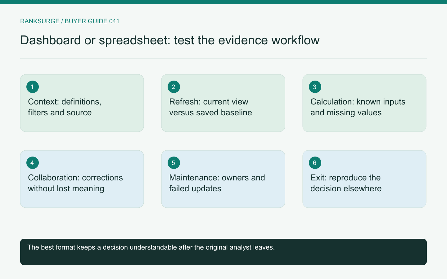
Compare SEO dashboards and spreadsheets by testing context preservation, repeatable calculations, collaboration and the cost of keeping evidence current.
TL;DR
- Decide on a home by the decision it must support: pick dashboards, spreadsheets, or both based on whether they keep recurring decisions “understandable and repeatable.”
- Use concrete trials: evaluate one recurring task, use a trial record and a small fixture to verify definitions, sources and calculations before committing to an interface.
- Require preservation and maintenance checks: verify who refreshes data, whether a dashboard preserves past states, and rehearse exits because dashboards can change evidence and spreadsheets can go stale.
Choose a home for decisions, not just numbers
An SEO dashboard and a spreadsheet can both display useful evidence. The right choice depends on how the team collects data, reviews it and returns to the same decision later. A dashboard is not automatically more trustworthy because it updates, and a spreadsheet is not automatically unreliable because a person edits it.
Start with one recurring task, such as reviewing the performance of a fixed set of commercial pages. Define who prepares the evidence, who reads it and what action the review should support. Then compare the two approaches using that same task rather than their general feature lists.
Inspect context before convenience
A number needs a definition, source, date range and relevant filters. A spreadsheet can preserve those fields explicitly, but analysts sometimes paste only the visible metric. A dashboard can retain them internally while making them difficult for a reader to discover.
Use a trial record with a query, country, device and observation period. Ask someone unfamiliar with the setup to explain exactly what the number describes. If either format hides that context, improve the record before deciding which interface is more attractive.
Google's Search Console performance documentation defines important dimensions and measures. Keep those definitions attached to the evidence when moving it into another reporting format instead of assuming a familiar column name preserves the full meaning.
Compare refresh with a stable historical record
A live dashboard can make recent data easy to view. It can also change the evidence behind an earlier decision if filters, source definitions or page groups are edited. Ask how the platform preserves the state that informed last month's recommendation.
A spreadsheet snapshot can retain that state, but it may become stale without an obvious warning. Give it a collection date and a defined refresh owner. The reader should know whether they are viewing a historical baseline or the latest available evidence.
The strongest workflow may use both: a current dashboard for monitoring and a saved decision record for the periodic review. The purchase question is whether the dashboard reduces enough recurring work to justify maintaining that additional system.
Test a calculation with known inputs
Create a small fixture whose totals your team can calculate independently. Include a missing value and a row that should be excluded. Compare the result in the dashboard and spreadsheet, then inspect how each explains its calculation.
A spreadsheet formula can be reviewed directly, but it can also be overwritten accidentally. A dashboard calculation may be protected, but the vendor may not expose the exact definition. Neither tradeoff is inherently unacceptable; the team needs to understand it.
Do not replace unknown values with zeros merely to make a chart render. Ask how each option displays incomplete data and whether readers can distinguish an unavailable measure from a genuinely empty result.
Evaluate collaboration with conflicting edits
Have two analysts review the same page set. One updates a classification while the other corrects a metric source. Determine whether the workflow preserves both changes and makes their authorship understandable.
A shared spreadsheet can support flexible notes and quick corrections. A structured platform may enforce consistent fields and project scope. Compare the mistakes your team actually makes: accidental row deletion, inconsistent labels, hidden filters or cross-project confusion.
RankSurge's MCP documentation includes saved keywords, project context and reports. These can form a structured evidence home, but evaluate the actual export and collaboration behavior you need rather than assuming every spreadsheet workflow has a direct platform equivalent.
Related reading: How to Use Vellum and OpenSEO for Your SEO Engine.
Related reading: How to Prompt Claude Code for SEO.
Account for the maintenance work
List the steps required for each monthly review: collecting data, checking scope, updating calculations, writing interpretation and sharing the result. Estimate effort using your own workflow instead of accepting a generic time-saving claim.
A dashboard may remove repetitive collection while leaving the interpretation unchanged. A spreadsheet may be economical for a small project but fragile across many clients and markets. The crossover depends on complexity and ownership, not only the number of rows.
Include connector failures in the trial. If a source stops updating, the dashboard should make that visible. If a manual export is late, the spreadsheet should not look current simply because someone opened it today.
Rehearse an exit from either format
Export the important evidence and ask another person to reproduce the key conclusion without the original author. Check whether filters, formulas, notes and source references survive.
A platform can create dependence on proprietary calculations, while a spreadsheet can depend on one analyst's undocumented conventions. The exit rehearsal reveals both kinds of lock-in.
Choose the format, or combination, that keeps your recurring decisions understandable and repeatable. The useful result is a reliable path from source evidence to a reviewed action. A more elaborate visual layer is worth buying only when it strengthens that path or removes work the team otherwise struggles to maintain.